Project 03 of 06
Equilibrium Capital Stationery
Image 01 of 02
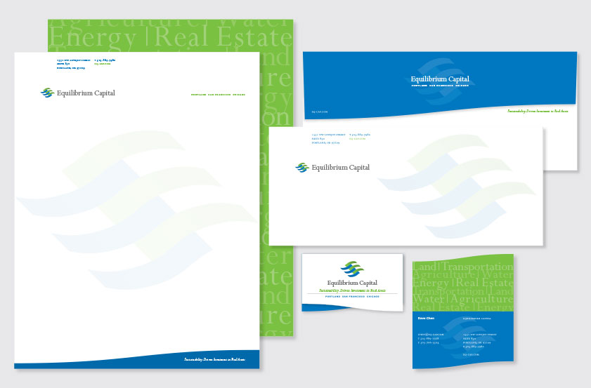
The letterhead front uses a wave motif inspired by the logo to present the company tagline. The letterhead back displays a typographic pattern defining the firm's investment sectors. The envelope uses the wave motif as an unusual die-cut flap.
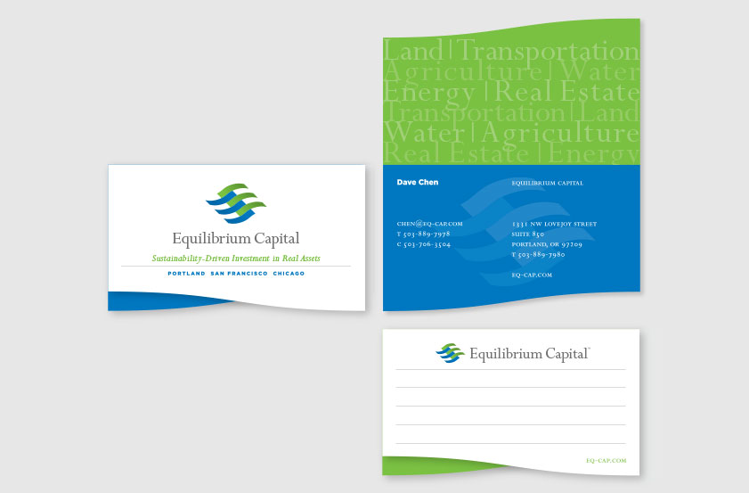
The business card uses the wave motif to create an unusual foldover format, referencing the form of the presentation folder. The front of the card introduces the company logo, tagline, and offices. The inside uses a typographic pattern to define the company's real assets. The back of the card functions as a useful space for notes.