Project 06 of 09
iAsiaWorks Website
Image 01 of 03
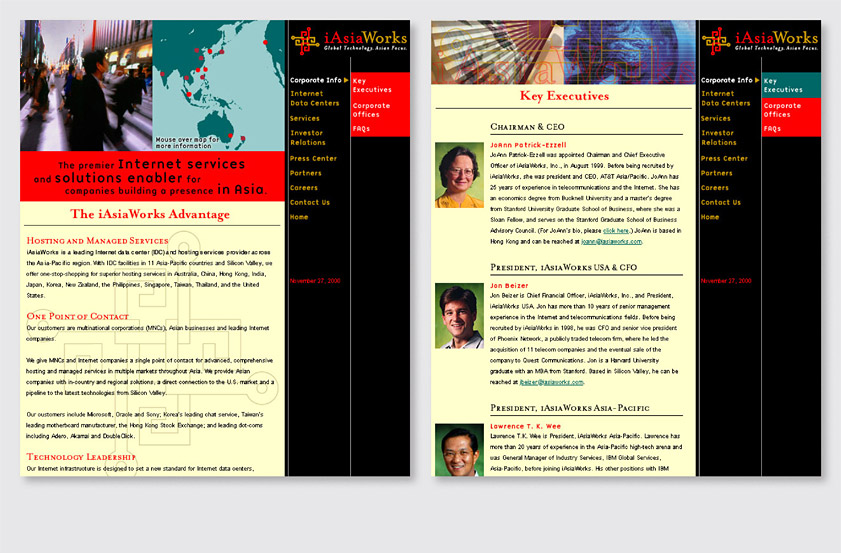
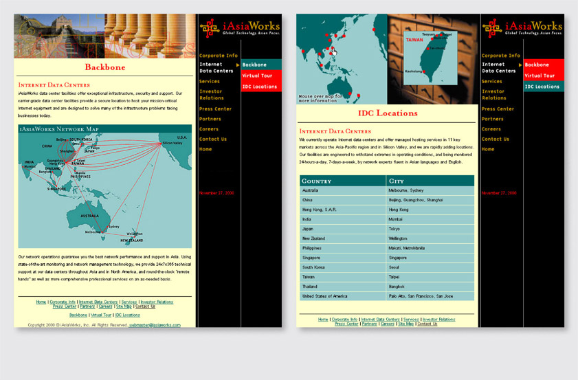
iAsiaWorks a leading Internet data center and hosting services provider for the Asia-Pacific region. Our solution reflects the firm’s Asian focus through its vertically oriented right to left navigation prevalent in Asian cultures, and integration of Eastern and Western symbolic imagery. The color palette of red, gold, black, and jade green is widely embraced throughout Asia. The “Key Executives” section uses an Asian fan and a globe to highlight the Asian-Pacific region. The “Backbone” section contrasts the Great Wall of China and classic architectural columns as symbols of structure, security, and support.
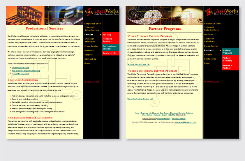
The “IDC Locations” section uses a Chinese herb chest as a metaphor for an Internet data center’s storage capacity. As the viewer mouses over the Taiwan dot on the map of Asia, a detail of the region pops up over the herb drawer image. The “Professional Services” section contrasts an Asian abacus and western briefcase as icons of business and commerce. The “Partners Programs” section is represented by a yin yang symbol and two interlocking gears working together in harmony.
Recognition
Rockport Graphic Design That Works, 2004
Rockport Promotion Design That Works, 2001
Rockport Graphic Design That Works, 2004
Rockport Promotion Design That Works, 2001