Project 13 of 45
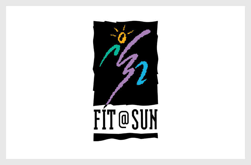
FIT@SUN Logo
FIT@SUN is Sun Microsystems’ employee fitness center. Our solution creates an energetic action figure in an expressive, hand-drawn style to symbolize the company’s innovative corporate culture.
The emanating rays around the figure’s head serve as a metaphor for “sun” and represent the company’s commitment to promoting their employee’s mental and physical well-being.
Recognition
American Corporate Identity 7,1992
Rockport Great Sporting Graphics, 1995
Rockport Letterhead & Logo Design 3, 1994
HBI The Big Book of Logos, 1999
Millim The Best in World Trademarks, 2000
PIE Books Corporate Image Design, 1992
Madison Square Press The New Logo from California, 1993
American Corporate Identity 7,1992
Rockport Great Sporting Graphics, 1995
Rockport Letterhead & Logo Design 3, 1994
HBI The Big Book of Logos, 1999
Millim The Best in World Trademarks, 2000
PIE Books Corporate Image Design, 1992
Madison Square Press The New Logo from California, 1993