
Project 25 of 45
Equilibrium Capital Logo
Image 01 of 02
Equilibrium Capital is a financial services firm focusing on sustainability-driven investments in real assets, including renewable energy, sustainable transport, green real estate, sustainable agriculture, land stewardship, and water management. The mirrored forms create a distinctive and proprietary “E” for equilibrium and represent bringing natural systems into balance. The curved forms evoke motion and flow, and their upward orientation symbolizes growth. The interlocking letters convey the firm’s commitment to connection and collaboration. The symbol’s blue and green colors represent water and land, respectively.
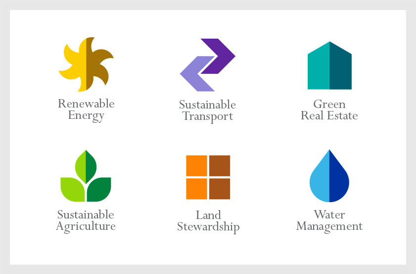
Each of the company’s investment sectors is represented by a different symbol. The symmetrical forms reference the company logo and reinforce the concept of balance and natural equilibrium, using a corresponding light/dark color scheme. The symbol’s basic forms and primary colors distinguish each investment sector icon while creating a cohesive family look for the brand.
Recognition
Creativity 42 (Silver), 2012
IDA International Design Awards (Gold), 2012
American Graphic Design & Advertising Awards 28, 2012
Rockport Design: Logo, 2014
Artpower Logo Talks III, 2014
Creativity 42 (Silver), 2012
IDA International Design Awards (Gold), 2012
American Graphic Design & Advertising Awards 28, 2012
Rockport Design: Logo, 2014
Artpower Logo Talks III, 2014