Project 09 of 09
Off-Site Records Management Website
Image 01 of 02
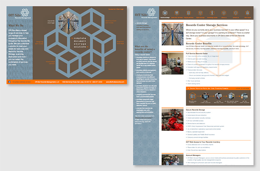
The homepage uses the company logo to form a unique navigational interface and provide strong brand recognition, creating a metaphor for the information cycle and conveying the company's commitment to providing "complete document storage solutions." An image of each service category dissolves into the logo in a continuous sequence, encouraging viewers to rollover each box to discover the image within the logo. The viewer can jump to the first page of each section by clicking on the image or text. The introductory sidebar uses the company logotype as a distinctive background pattern, providing name recognition and differentiating the homepage from interior pages.
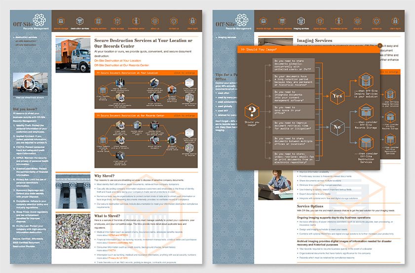
Secondary pages use symbolic icons as navigational buttons, revealing eye-catching orange pull-down menus for easy navigation. Interior pages feature a generous main content area with a large screened-back icon to reference the navigational button. Color-coded type clearly defines headings, subheads and text for the viewer. The informational sidebar features engaging factoids to augment information in the main area, using interlinked company logos to create a proprietary background pattern and distinguish interior pages from the homepage. Informative flow charts with bright orange titles use a hexagonal grid to explain the simple steps customers can take to safeguard their important information with the company. Viewers can easily click on the image to enlarge.
Recognition
Graphis Branding 6 (Gold), 2012
PIE Books Pictogram & Icon Graphics 2, 2007
Graphis Branding 6 (Gold), 2012
PIE Books Pictogram & Icon Graphics 2, 2007