Project 09 of 09
Art Center DOT Launch Inspiration
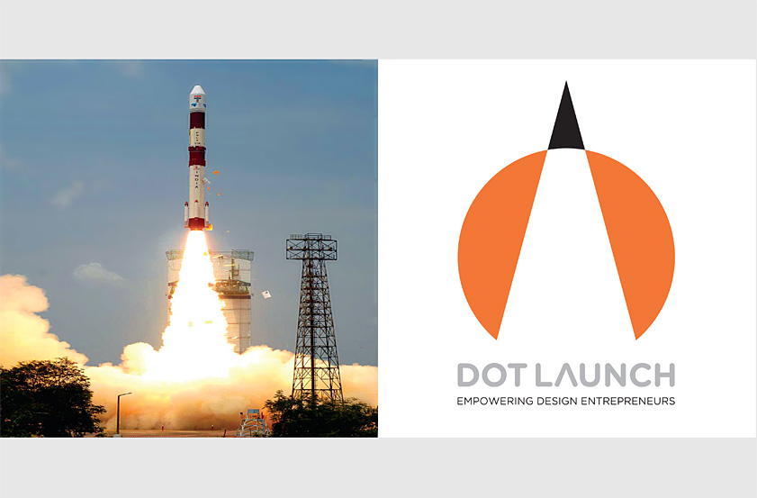
Our DOT Launch brand uses the orange dot to connect the initiative to the school and a soaring rocket to represent the launch, ascendancy and aspiration of new enterprises.
The rocket metaphor symbolizes innovative businesses achieving lift off, bold ideas taking flight and creative designers breaking boundaries.
Recognition
Graphis Design Annual (Gold), 2013
Creativity 42 (Platinum), 2012
IDA International Design Awards (Bronze), 2011
Spark Design Awards (Bronze), 2013
American Graphic Design Awards, 2012
American Graphic Design & Advertising Awards 28, 2012
University and College Designers Association, 2013
Graphis Design Annual (Gold), 2013
Creativity 42 (Platinum), 2012
IDA International Design Awards (Bronze), 2011
Spark Design Awards (Bronze), 2013
American Graphic Design Awards, 2012
American Graphic Design & Advertising Awards 28, 2012
University and College Designers Association, 2013