Project 02 of 06
Equilibrium Capital Investment Sector Symbols
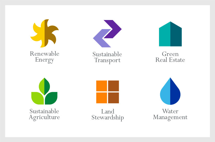
Each of the company’s investment sectors is represented by a different symbol. The symmetrical forms reference the company logo and reinforce the concept of balance and natural equilibrium, using a corresponding light/dark color scheme.
The symbol's basic forms and primary colors distinguish each investment sector icon while creating a cohesive family look for the brand.
Recognition
Creativity 42 (Silver), 2012
IDA International Design Awards (Gold), 2012
American Graphic Design & Advertising Awards 28, 2012
Rockport Design: Logo, 2013
Creativity 42 (Silver), 2012
IDA International Design Awards (Gold), 2012
American Graphic Design & Advertising Awards 28, 2012
Rockport Design: Logo, 2013