

Project 02 of 09
iAsiaWorks Stationery
Image 01 of 04
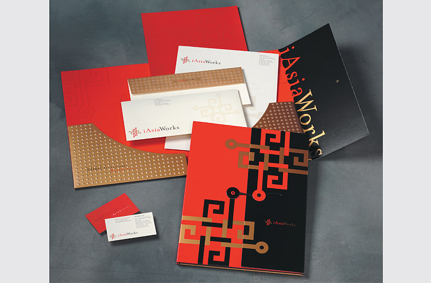
iAsiaWorks a leading Internet Data Center company and hosting services provider for the Asia-Pacific region. Our solution for their presentation folder uses the logo as an Asian string-tie clasp to provide prospective clients in Asia with the experience of unwrapping a gift. The folder pockets use embossed circles to simulate the rivets of an Asian door and create the shape of a Chinese moon gate, symbolic of iAsiaWorks' role in providing its customers with a gateway into Asia.
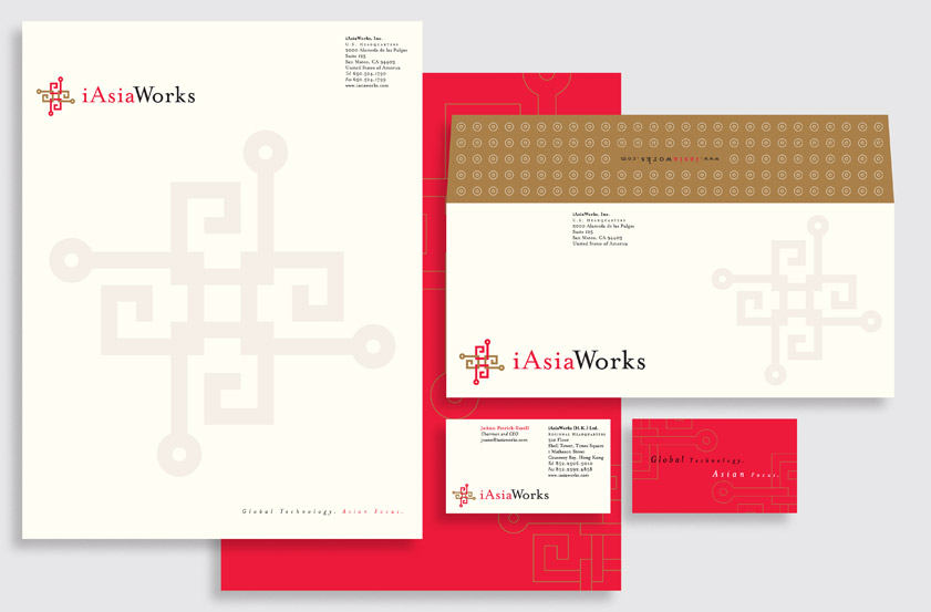
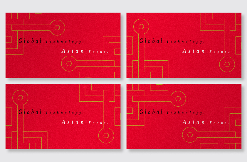
The letterhead front features a large watermark of the logo. The back uses an outline version of the logo to suggest gold embroidery on red silk. The envelope flap uses a pattern of circles derived from the logo. The back of each business card combines to form a complete logo to symbolize the firm's team approach to client service.
Recognition
Creativity 30, 2000
Print Regional Design Annual, 2001
Adobe Designer Templates Guide, 2003
Rockport Graphic Design That Works, 2004
Rockport Promotion Design That Works, 2001
Almanac of Asia-Pacific Design 06, Vol. 2, 2005
North Light Creative Edge Letterhead + Business Card Design, 2001
Creativity 30, 2000
Print Regional Design Annual, 2001
Adobe Designer Templates Guide, 2003
Rockport Graphic Design That Works, 2004
Rockport Promotion Design That Works, 2001
Almanac of Asia-Pacific Design 06, Vol. 2, 2005
North Light Creative Edge Letterhead + Business Card Design, 2001