Project 09 of 09
Symantec Corporate Brochure
Image 01 of 07
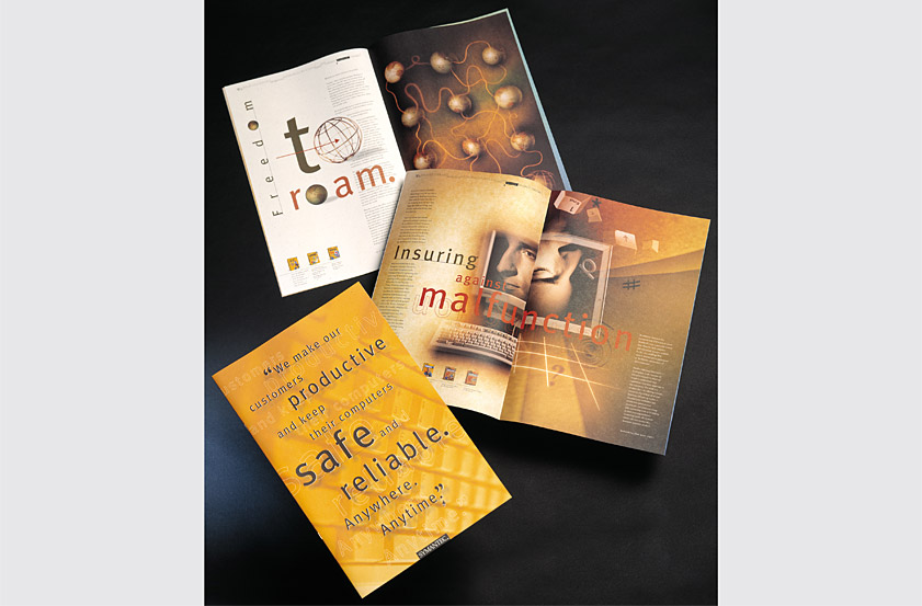
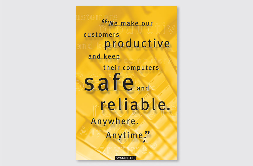
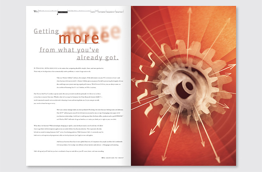
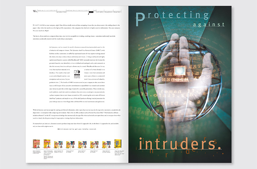
Symantec is the world's largest maker of utility and security software for personal computers. Our solution uses the company's mission statement on the cover to express their products's innovative features as valuable customer benefits. On each spread, the mission statement appears as an interface-inspired pull down menu, highlighting a key word to identify each product category. Conceptual photography and expressive typography are employed to convey a compelling user-focused message. An expanding gear creates a powerful metaphor for software which increases productivity. A hand and globe combine to symbolize the safety provided by the industry-leading Norton AntiVirus software.
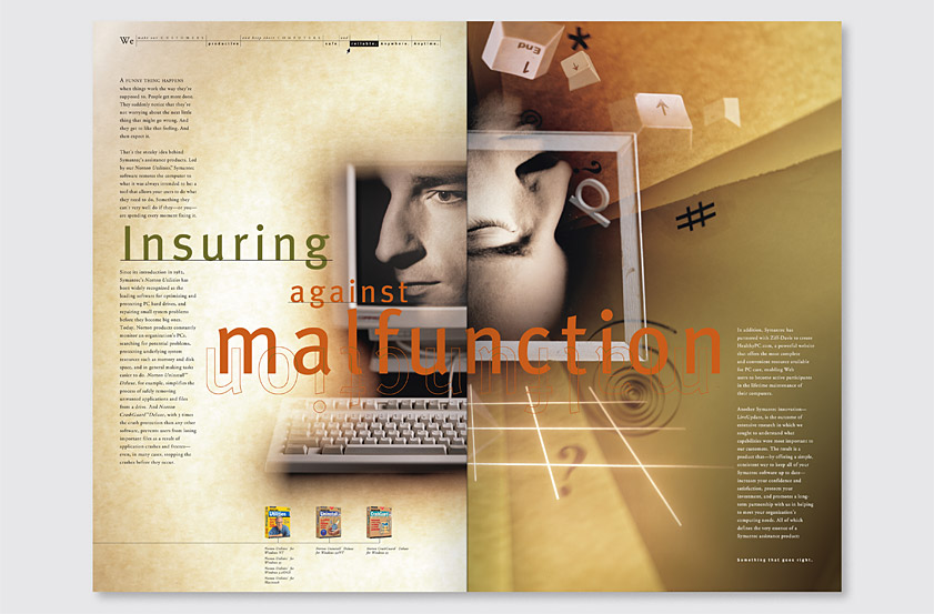
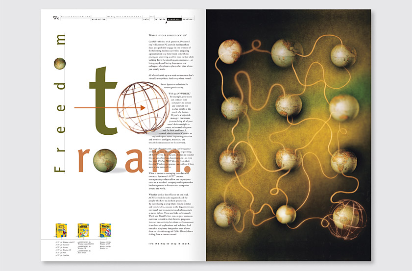
The stark contrast of a computer being fully functioning and awake vs. malfunctioning and asleep conveys the difference provided by the category-leading Norton Utilities software. A series of interconnected globes evokes the company's remote access software which enables users to be productive anywhere in the world. The project provided lasting value for Symantec, as the brochure was able to be reused for several years by simply updating the box art as needed, and the evocative images enjoyed extended use as corporate art throughout Symantec headquarters.
Recognition
Creativity 28, 1998
Step-By-Step Graphics 100 Design Annual, 1999
Applied Arts Design & Advertising Awards, 1998
American Advertising Federation ADDY Awards, 1998
San Francisco Art Directors Club Show 12, 1998
Western Art Directors Club West Coast Show, 1998
PIE Books Corporate Profile Graphics 3, 1998
BT Batsford Design and Layout: Understanding and Using Graphics, 2003