Project 04 of 09
The Design Accelerator Stationery
Image 01 of 03
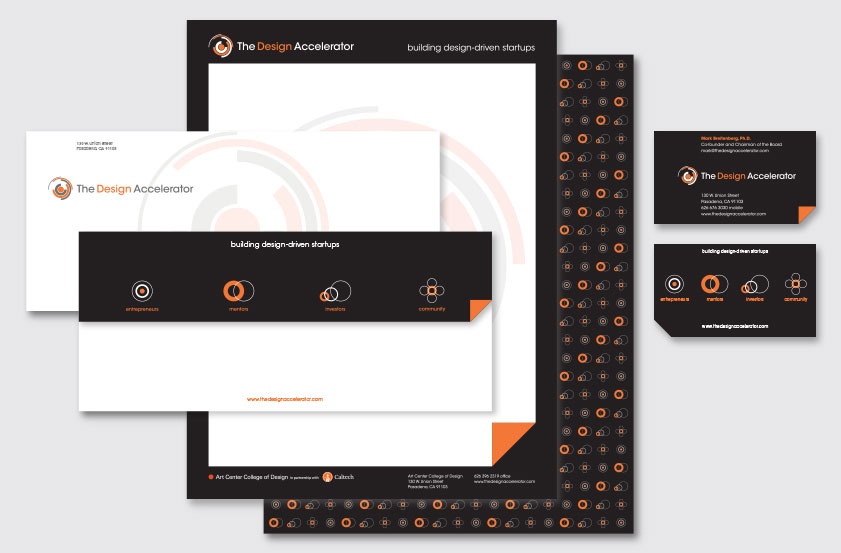
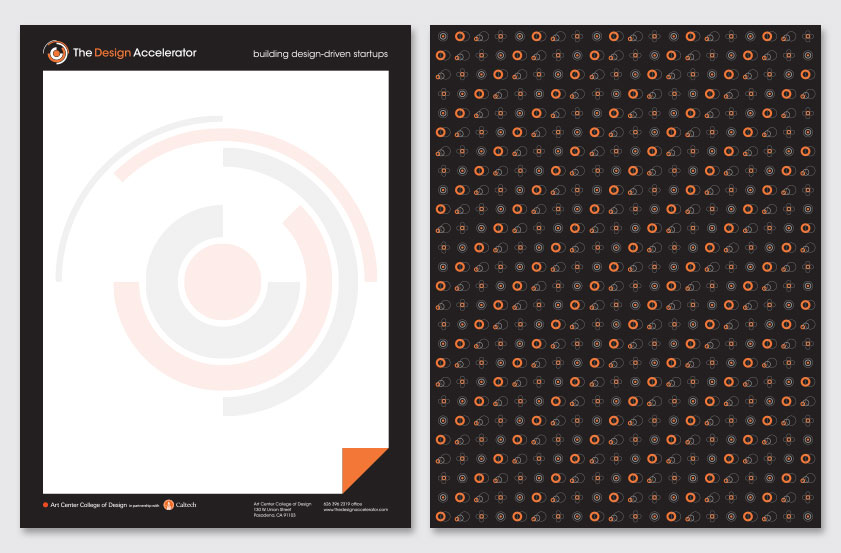
The stationery uses a black frame and turned edge motif to reference the website, creating the illusion of a page within a page and evoking the uncovering of something new. The large screened back logo defines the content area of the letter. The Target Audience symbols create a striking background pattern on the back.
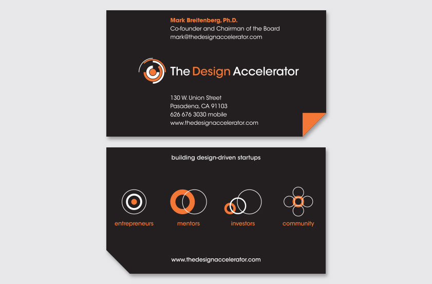
The envelope uses a large screened-back logo on the front. Its contrasting black flap introduces the Target Audience symbols, tagline and website, using a die cut turned edge corner to create a unique form. The business card uses a die cut turned-edge corner on the front as a metaphor for the ability to look beyond. The contrasting black back displays the Target Audience symbols, tagline and website.
Recognition
Creativity 43 (Silver), 2013
American Graphic Design Awards, 2013
Creativity 43 (Silver), 2013
American Graphic Design Awards, 2013