Project 08 of 09
The Design Accelerator Website
Image 01 of 02
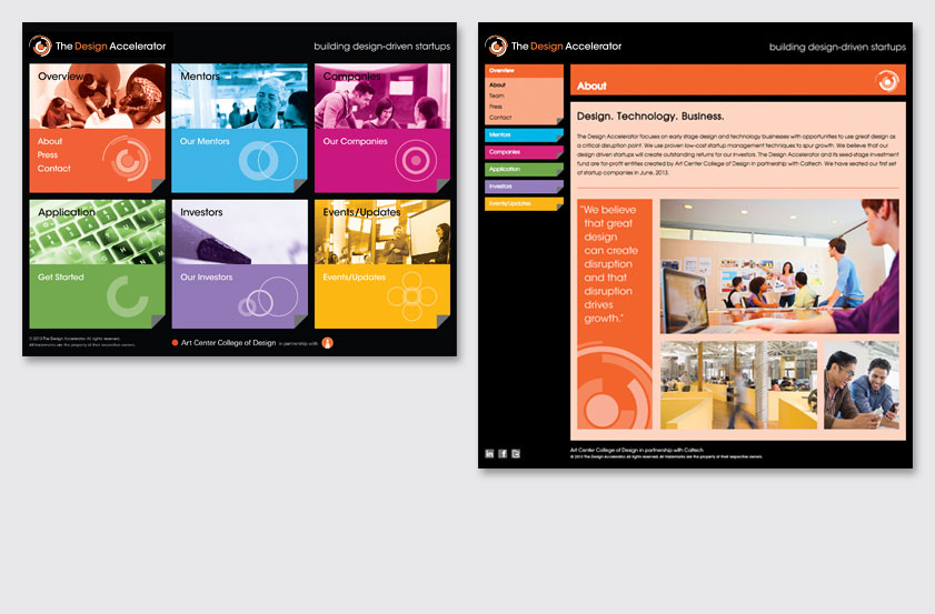
Our solution uses self-identifying categories to invite the viewer to select their section of interest. The black frame and turned edge motif create a metaphor for unveiling something new while providing the illusion of pages within a page. The homepage navigation enables the viewer to roll over each of the six color-coded images to reveal the corresponding menu and symbol within each box.
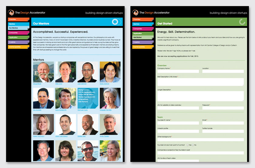
The interior page navigation enables the viewer to roll over each bar to reveal a drop-down screened-back sub-navigation. Each page is defined by a color-coded header, corresponding symbol and screened-back text box. In the About Us section, a compelling pull-quote defines the program's point of differentiation. To incorporate interactivity throughout the site, the Team, Mentors and Companies sections enables the viewer to roll over the image to reveal pertinent information. The text below each image provides a link to more content.
Recognition
Creativity 43 (Silver), 2013
American Graphic Design Awards, 2013
Creativity 43 (Silver), 2013
American Graphic Design Awards, 2013