Project 04 of 06
Vaxart Stationery
Image 01 of 02
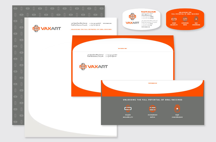
The letterhead front uses the tablet shape to create a unique border. The letterhead back uses a subtle pattern of vertical and horizontal tablets while highlighting the oral vaccine platform's three primary benefits. The envelope front uses the tablet edge to create a distinctive frame, forming the complete tablet shape when the flap is opened. The envelope back displays the tagline and the oral vaccine platform's three primary benefits. The envelope inside employs the orange vertical and horizontal tablets as a security pattern.
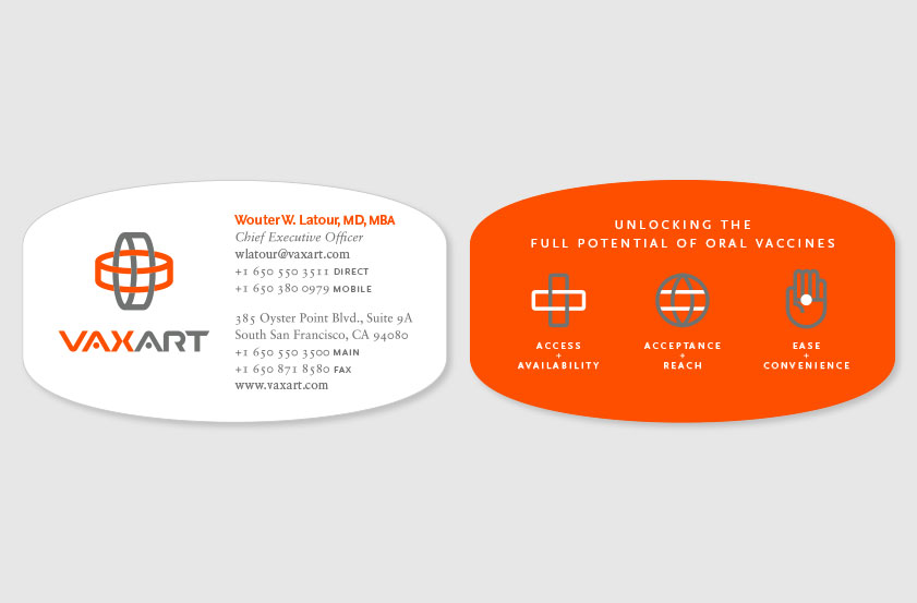
The business card's distinctive tablet shape creates a unique and memorable form. The orange back of the card creates a striking contrast with the front, highlighting the tagline and the oral delivery platform's three primary benefits.
Recognition
Creativity 44 (Silver), 2014
American Graphic Design Awards, 2014
American Health + Wellness Design Awards, 2014
Creativity 44 (Silver), 2014
American Graphic Design Awards, 2014
American Health + Wellness Design Awards, 2014