
Project 07 of 09
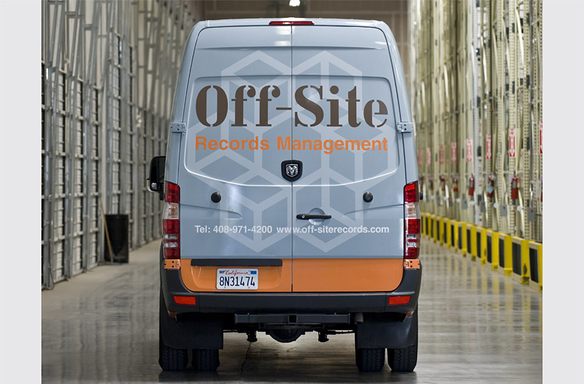
Off-Site Records Management Vehicle Graphics
Image 1 of 10
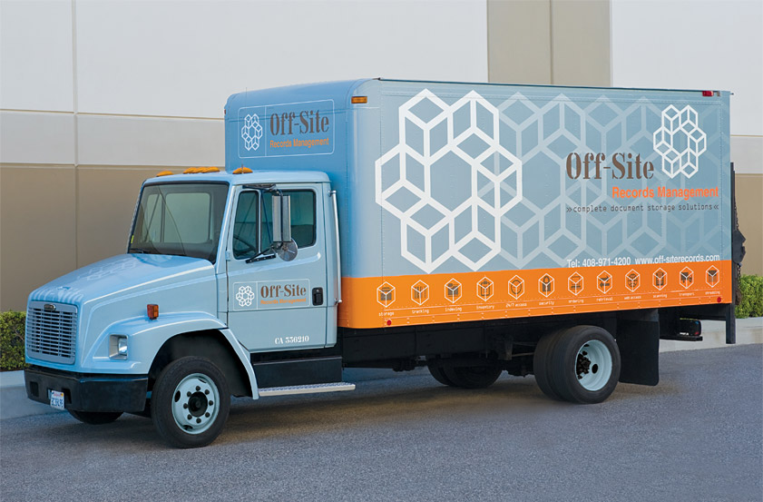
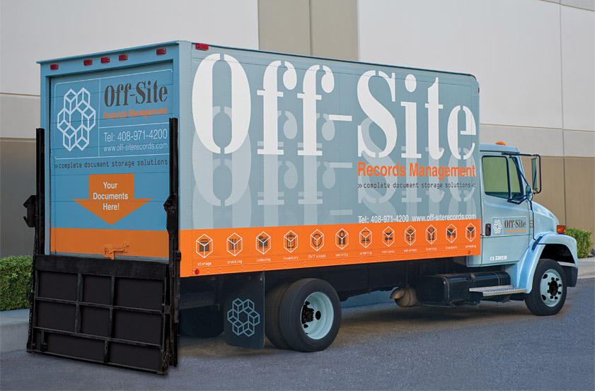
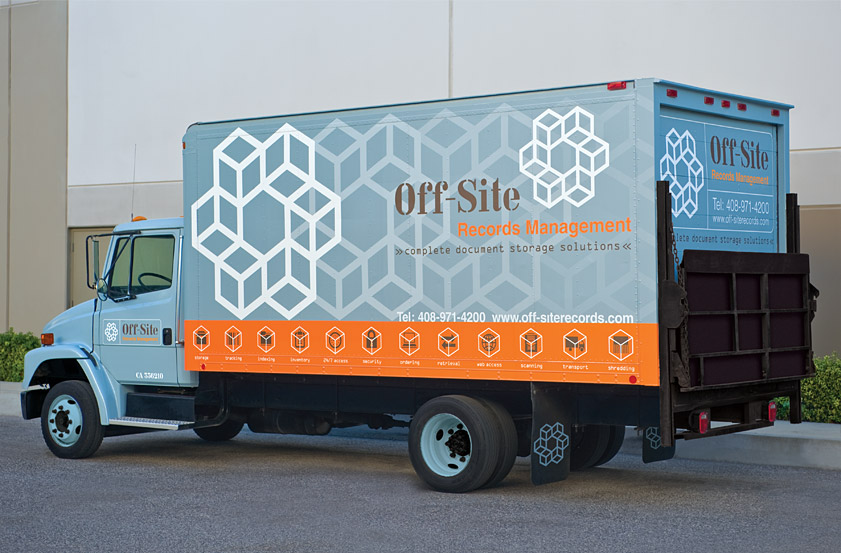
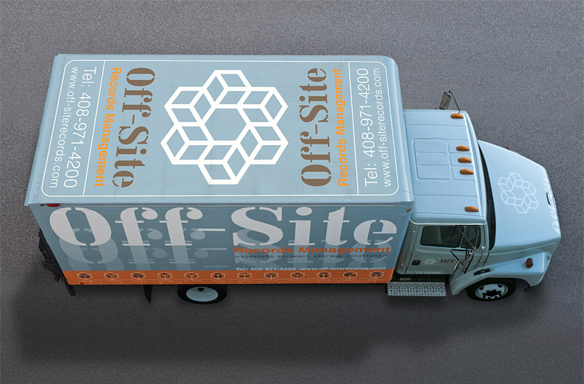
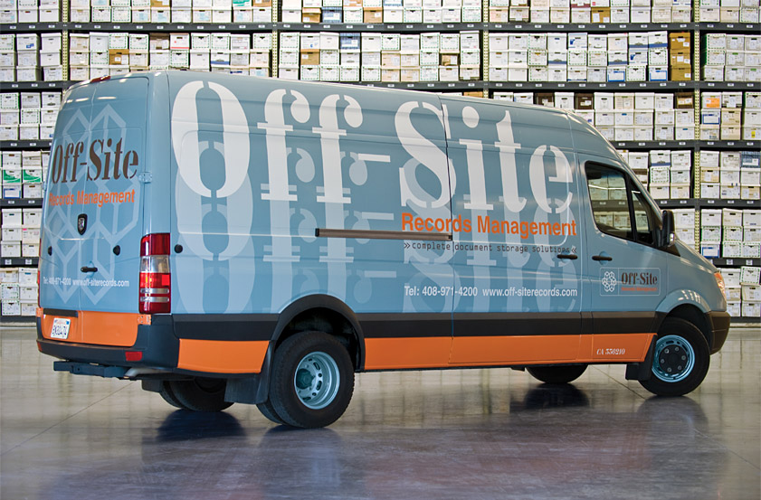
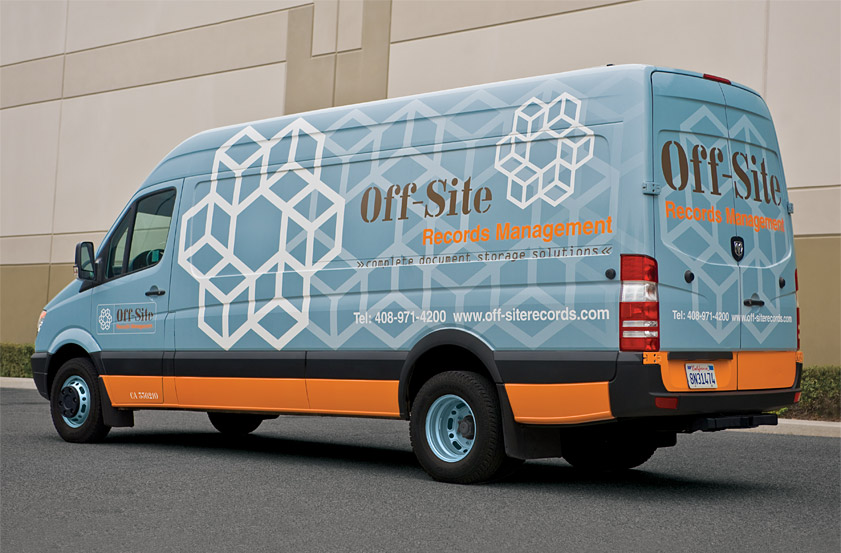
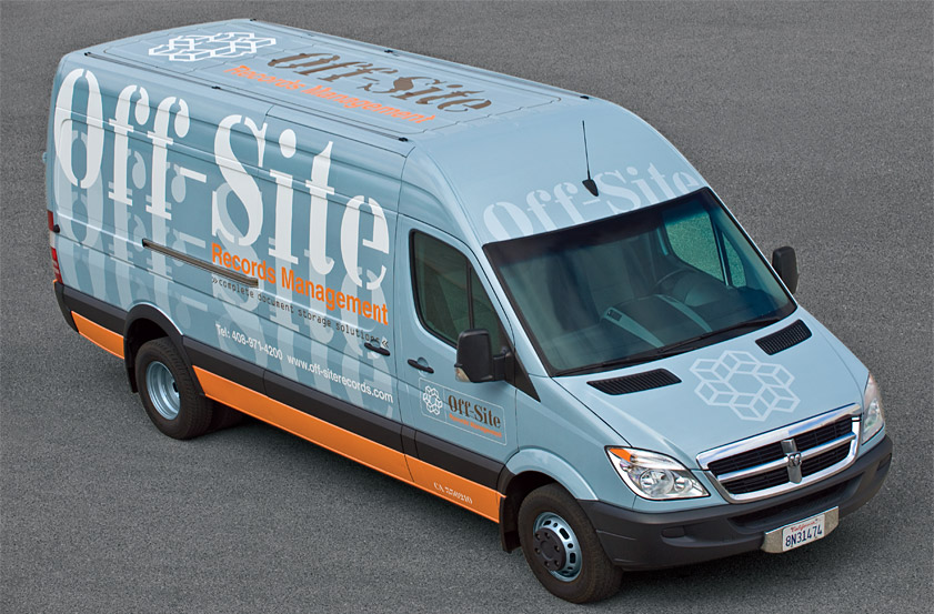
Our solution for their truck and van graphics showcases the symbol on one side and the company name on the other, using gradation as a metaphor for customers moving their documents "off-site." The logo's dimensional boxes suggest space and storage, forming a circle to represent the access, retrieval and linking of information.
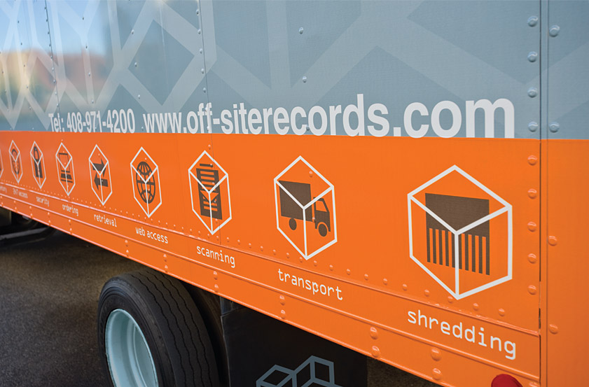
On the truck, an eye-catching orange band displays the firm's complete range of document storage solutions. The truck's liftgate encourages new customers to imagine the arrival of their documents, and the top functions as a moving billboard displaying the firm's contact information from both directions.
Recognition
Graphis Branding 6 (Gold), 2012
Creativity 40 (Gold) 2010
American Graphic Design Awards, 2010
Graphis Branding 6 (Gold), 2012
Creativity 40 (Gold) 2010
American Graphic Design Awards, 2010