

Project 06 of 09
Off-Site Records Management Shred Truck Graphics
Image 01 of 06
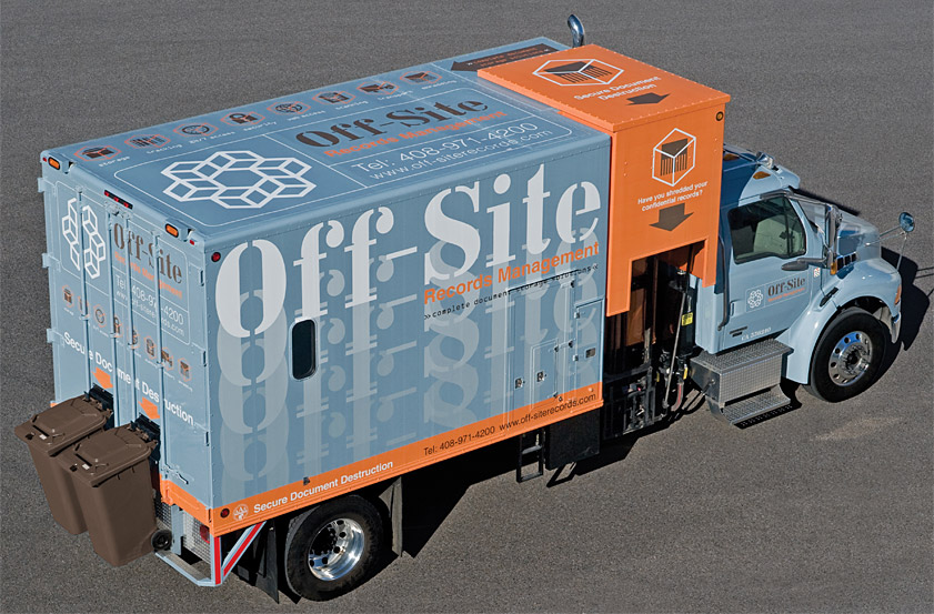
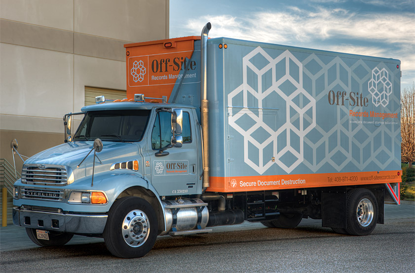
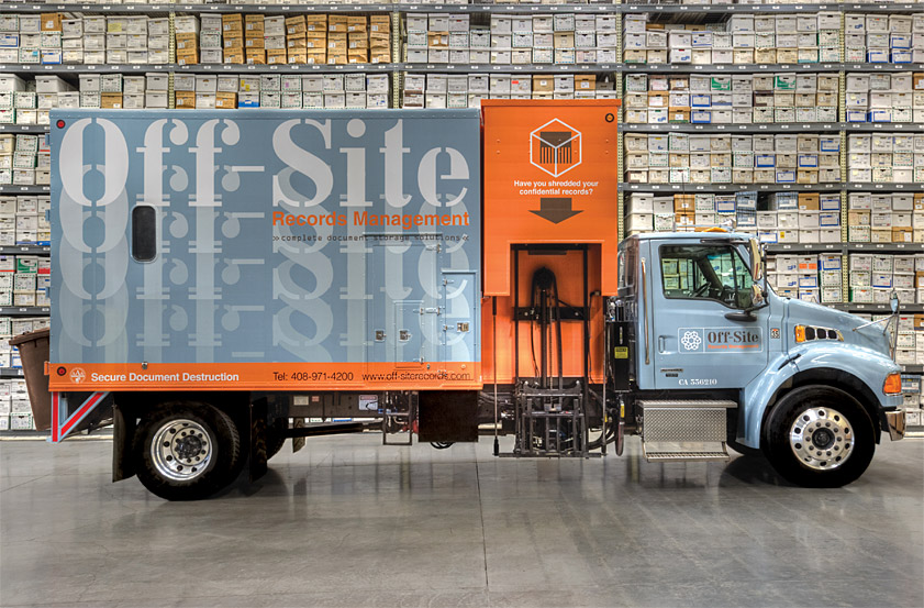
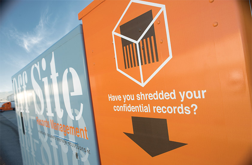
Our solution uses the company's descriptive name and gradation to create a metaphor for customers moving their documents "off-site." The shredder mechanism is highlighted in orange.
The graphics showcase the symbol on one side and the company name on the other. The top functions as a dimensional billboard to display the firm's complete range of document storage solutions.
Recognition
Communication Arts Design Annual 50, 2009
Graphis Design Annual (Gold), 2011
Graphis Branding 6 (Gold), 2012
Spark Design Awards (Finalist), 2009
IDA International Design Awards, 2009
Creativity 39 (Gold), 2009
HOW International Design Awards, 2010
Applied Arts Design & Advertising Awards, 2010
American Graphic Design & Advertising Awards 26 (2nd Place), 2010
Graphis Archigraphia Redux, 2016
HOW Books Damn Good, 2011
Hoffmitz Milken Center for Typography Collection, 2016